Work / Branding
We created Home 1 Suites a distinctive identity for a hospitality brand.
About Home 1 Suites.
Home 1 Suites Extended Stay is an extended-stay hospitality brand focused on providing comfortable accommodation for longer visits. Its properties offer suite-style rooms and amenities designed around convenience and independent living.
- Suite-style
- accommodation
- Comfortable spaces for longer stays
- Comfort
- & convenience
- Designed around everyday living
- Extended
- stay
- Flexible hospitality for longer visits
- Home-like
- experience
- Independent living with added comfort
Comfortable living
Suite-style accommodations designed to provide comfortable & practical environment for stays.
Guest-centered experience
Thoughtful spaces & amenities designed for convenience, independence, & long-term guests.
The problem
The challenge.
- Create a distinctive identity for an extended-stay hotel brand
- Combine hospitality and home-inspired elements into one mark
- Make the logo clear and recognizable across different applications
- Establish a professional visual foundation for the brand
- A warm and welcoming visual language that feels like home
- Ensure the identity is versatile enough to work across signage, digital platforms, and in-room experiences
Our part
What Zohlink did.
Our role focused on developing the core logo identity for Home 1 Suites Extended Stay. We created a visual direction that connects the brand with ideas of home, comfort, and hospitality while keeping the identity clear and professional.
- Logo design & brand refinement
In scope
Project scope.
- Logo design
- Concept development
- Typography
- Visual identity
How it ran
The process.
- 01
Research
Studied the hospitality category and explored visual elements commonly associated with accommodation, comfort, and home.
- 02
Concept
Developed different visual directions around the idea of creating a home-like feeling within an extended-stay experience.
- 03
Design
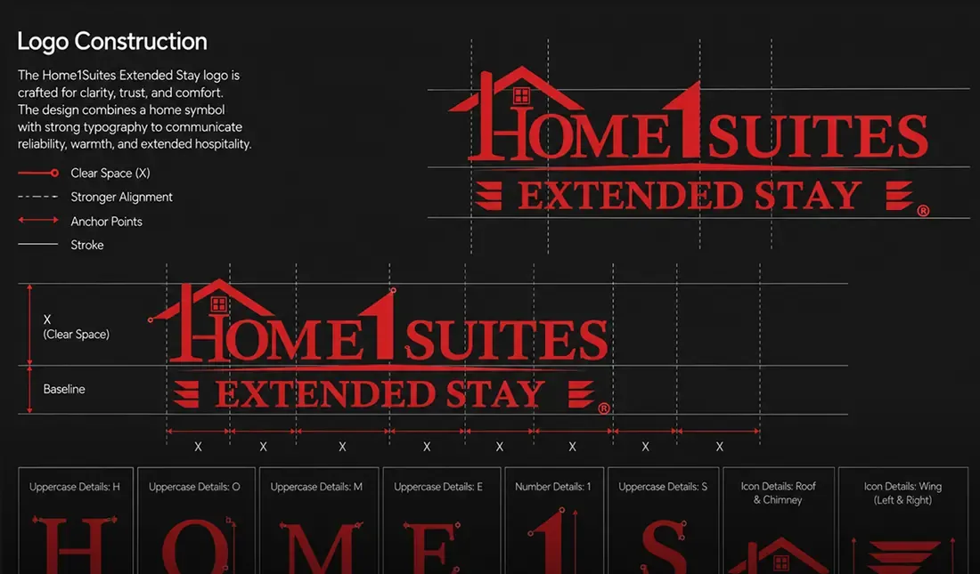
Turned the selected concept into a complete logo by combining the symbol, typography, and brand name into a balanced composition.
- 04
Refinement
Refined the logo's proportions, spacing, typography, and overall composition to create a clean and polished final identity.
The work
Project gallery.
The result
The outcome.
The Home 1 Suites Extended Stay logo brings together hospitality, comfort, and the idea of home into a distinctive visual identity. The final design creates a stronger foundation for the brand while giving it a professional and recognizable presence across different applications.
- Distinctive brand identity
- Clear home-inspired concept
- Stronger visual recognition
- Professional hospitality presence
- Memorable logo composition
- Scalable brand mark
Impact
- Welcoming
- hospitality identity
- A warm visual direction reflecting comfort and extended stays.
- Recognizable
- visual identity
- A distinctive symbol and wordmark built for stronger recognition.
- Professional
- brand presence
- A polished logo that gives the brand a more credible appearance.
- Versatile
- brand application
- A flexible identity suited for print, signage, and digital use.